-
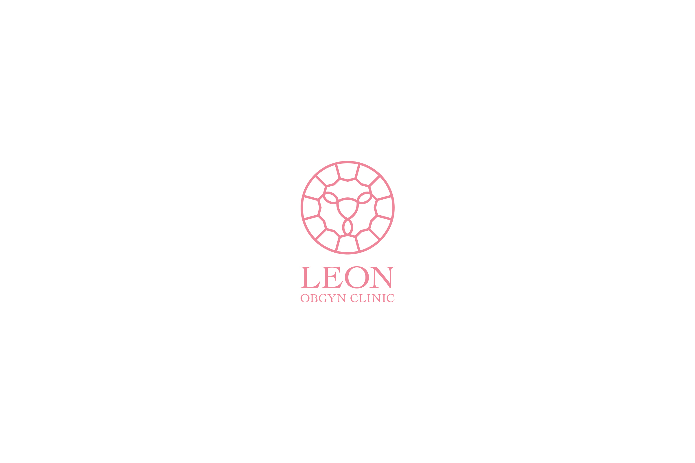
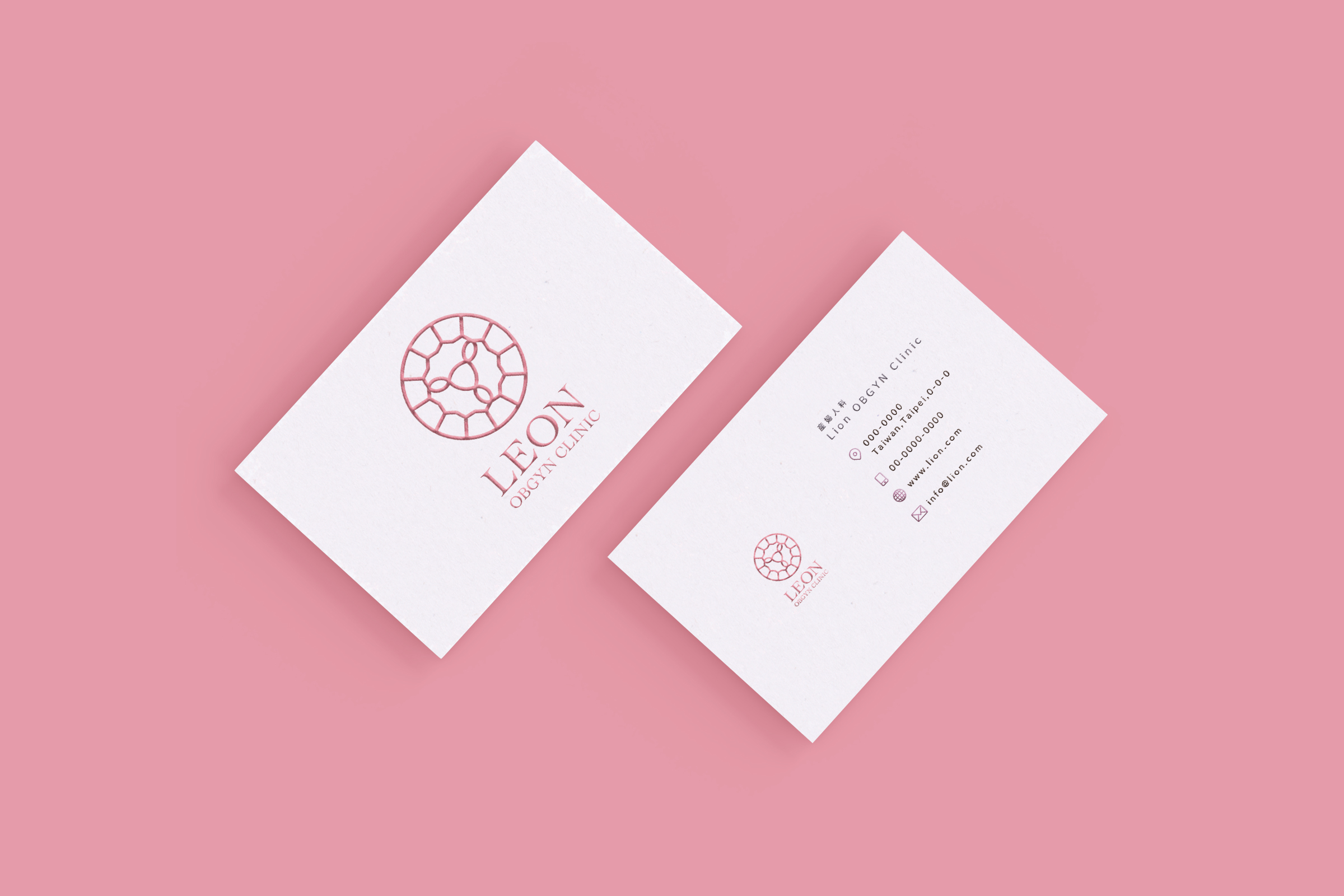
Leon OBGYN Clinic
Roaring for Women’s Health with Cutting-Edge Care.
台湾、台北に2024年に新規開業予定の「良全婦產科」(英文名:Leon OBGYN Clinic)のロゴデザインを制作しました。コンセプトは、子宮の形をライオンの顔に見立て、外周をライオンの立髪とダイアモンドカットの融合デザインとしています。これは、子どもを宝石に例える意味もこめられています。
「Leon」は、ラテン語で「ライオン」を意味し、中国語の「良」「糧」の発音にも近く、院長の苗字「Lee」と「neo(新しい)」を組み合わせた造語です。院長の星座が獅子座であることから、ロゴのデザインにも反映しました。
さらに、ライオンのモチーフと超音波の要素を組み合わせることで、院長の専門である胎児超音波検査、乳房超音波、婦人科超音波の分野を象徴しています。このロゴは、最新のデジタル設備とアプリを導入する新しいクリニックの先進性も表現しています。
The logo for Leon OBGYN Clinic ingeniously merges a uterus shape with a lion’s face, while the outer circle depicts both a lion’s mane and a diamond cut, symbolizing children as precious gems. The name “Leon” carries multiple meanings: it’s Latin for “lion”, echoes Chinese characters for “good” and “grain”, and combines the doctor’s surname “Lee” with “neo” (new). This lion theme also aligns with the doctor’s Leo zodiac sign, adding a personal touch to the clinic’s identity.
Incorporating ultrasound wave elements into the design highlights the clinic’s specialties in fetal, breast, and gynecological ultrasound examinations. This modern, multifaceted logo represents the clinic’s commitment to advanced digital equipment and app-based services, effectively communicating its dedication to high-quality, innovative obstetric and gynecological care. The overall design encapsulates the essence of a new-generation OBGYN clinic that seamlessly blends traditional care with cutting-edge technology.